
React Native Multiplatform: Recreating Apple & Google Photos in React Native — Part 2
 Bartłomiej Bukowski•Sep 12, 2025•13 min read
We’re back with the second article in our Apple Photos series, diving into the next set of challenges on the way to building a multiplatform photo-gallery app.
In the previous article, we walked through basic aspects of creating an efficient photo gallery list, focusing on different ways to optimize image loading and rendering.
This time, we’re taking our app to the big screen. We’ll show you how to adapt it for modern TV platforms — including tvOS, AndroidTV and Amazon Fire TV, covering critical aspects of both configuration and design. We’ll also show you how to combine mobile and web support in React Native, creating a truly cross-platform app that supports all the major platforms with a single codebase.
So, without further ado, let’s dive in!
P.S. If you’d rather watch, check out our YouTube episode, where we walk you through the process in this article and Giovanni Laquidara from Amazon shares some extra design insights:
From mobile to (Fire) TV
When moving a React Native app from mobile to TV platforms, there are a few important things to address:
- proper configuration to ensure TV compatibility
- design adjustments with a strong focus on remote control navigation
- technical challenges caused by limited library support.
Today, we’ll cover how to tackle common issues across all three areas, using Fire TV as our main example while also looking at tvOS and Android TV to highlight key differences between the platforms.
Configuration aspects
React Native is mainly designed for Android and iOS, and its support for TV platforms is still limited — especially around handling remote inputs and providing TV-specific components. Still, thanks to its flexibility, there are forks that extend its core functionality to include other Out-of-Tree Platforms.
The react-native-tvosfork enhances React Native with the features required for Apple TV and Android TV, making it possible to adapt mobile applications to TV environments. To use it, you’ll need to specify the correct dependency in thepackage.json file:
"react-native": "npm:react-native-tvos@latest",Because react-native-tvos is a fork of basic react-native, it provides full compatibility with both Android and iOS, so no separate configuration is necessary.
When working with an Expo project, in addition to react-native-tvos, you should use the @react-native-tvos/config-tv plugin, as described in the official Expo docs. It automatically configures Android and iOS projects for TV by modifying native files, removing unsupported dependencies, and adding the necessary assets for TV platforms.
To add the plugin to your Expo project, run the following command in your terminal:
npx expo install @react-native-tvos/config-tv - - devYou should also ensure that the plugin is present in the app.json/app.config.ts file:
export default {
  expo: {
    plugins: ["@react-native-tvos/config-tv"]
  }
}
You can activate the plugin either by explicitly setting the "isTV": true plugin parameter or by using the EXPO_TV=1 environment variable, which should be set during the prebuild phase. This last option is actually the most flexible, since it lets you use the same configuration for both mobile and TV platforms:
EXPO_TV=1 expo prebuild
EXPO_TV=1 expo start
To run your app specifically on Amazon Fire TV, ensure it’s built with the appropriate SDK version. According to Amazon’s developer documentation, the minimum SDK requirements depend on the specific Fire OS version:
- Fire OS 5: Based on Android 5.1 (Lollipop, API level 22)
- Fire OS 6: Based on Android 7.1 (Nougat, API level 25)
- Fire OS 7: Based on Android 9 (Pie, API level 28)
In an Expo project, you can set the target SDK by configuring the app.json/app.config.ts file:
export default {
  expo: {
    android: {
      targetSdkVersion: 34
    }
  }
}
TV-specific development
Developing applications for TV platforms often requires specific code to handle features such as responsive layouts or TV-specific components. In this context, the Plaform.isTV flag is essential to determine if the app is running on a TV device. By using it, you can define TV-specific code blocks, as shown below:
if (Platform.isTV) {
   return (
     <TouchableOpacity onPress={pressWrapper}>
       {children}
     </TouchableOpacity>
   );
 }
If you need more advanced TV-specific customizations, you can take advantage of platform-specific file extensions like tv.ts and tv.tsx to override the default implementations on tvOS and Android TV. To ensure .tv.ts and .tv.tsx files are resolved automatically, configure Metro to recognize them as platform-specific extensions:
// metro.config.js

if (process.env.EXPO_TV) {
 config.resolver.sourceExts = [
   ...(config.resolver.sourceExts || []).map((ext) =>
  `tv.${ext}`),
   ...(config.resolver.sourceExts || []),
 ];
}
Note that by specifying TV extensions first, you can force Metro to resolve and load .tv.ts and .tv.tsx files instead of their generic counterparts.
Library support overview
All major TV platforms — including Android TV, Fire TV, and tvOS — support most common React Native and Expo libraries, although there are some exceptions.
For example, the expo-image-manipulator library works for image downscaling on mobile builds of our app but isn’t supported on tvOS.
To check the compatibility of a given library with your desired TV platform, visit https://reactnative.directory, and enable TV platforms filters (tvOS or Works with FireOS).
Design aspects
One of the main challenges when adapting an app for TV platforms is supporting remote control navigation. This involves managing focus correctly and handling remote-specific actions. There are a few ways to approach this:
Touchable elements
With react-native-tvos, touchable elements automatically receive focus when navigated with the D-pad or arrow keys, and trigger onPress when the user confirms with the select/enter button. The main advantage of this approach is that it works across all major TV platforms, and doesn’t require a separate code for mobile platforms, since touchable elements are native to both Android and iOS.
In this section, we’re going to focus specifically on the TouchableOpacity component as an example.
TouchableOpacity provides a set of TV-specific props for handling remote controller actions. The most important ones are:
hasTVPreferredFocus— sets an initial focus when the screen loads.onFocus/onBlur— handles focus change events for UI feedback.onPress— triggered when the user confirms their choice.nextFocusUp/nextFocusDown/nextFocusLeft/nextFocusRight— defines directional navigation on Fire TV / Android TV.tvParallaxProperties– configures the parallax effect on tvOS.
The code below provides a simple example of how to use TouchableOpacity. You can also check out this example from our app, where TouchableOpacity wraps a focusable image component.
<TouchableOpacity
  hasTVPreferredFocus
  onFocus={() => setHighlight(true)}
  onBlur={() => setHighlight(false)}
  onPress={() => handleSelect()}
  nextFocusRight={nextRef}
  tvParallaxProperties={{ enabled: true }}
>
  <Text>Play</Text>
</TouchableOpacity>
Touchable elements provide sufficient functionality to handle simple navigation in our Photos Gallery app. However, if you’re looking for a more extensive and future-proof way to handle touch-based input, check out the Pressable API.
react-tv-space-navigation
react-tv-space-navigation helps manage TV remote focus by maintaining a virtual focus tree for LRUD (Left, Right, Up, Down) navigation across nested React components. It dynamically updates focus targets as elements mount or change, restores focus to the last focused child, automatically scrolls containers to keep the focused item visible, and skips over non-focusable elements.
Key components of react-tv-space-navigation:
SpatialNavigationRoot– the top-level provider that manages focus state and navigation logic for the entire app.SpatialNavigationView– defines a focusable container with a navigation direction (horizontal or vertical), grouping related focusable elements and managing their LRUD behavior.SpatialNavigationFocusableView– a focusable element that responds to focus and select events and is automatically included in the navigation tree.SpatialNavigationScrollView– a scrollable container that keeps the focused item visible by automatically scrolling when needed.
For a detailed example, take a look at the sample project in Amazon’s official repository. It covers common use cases, like setting up remote control navigation for lists and side panels.
TVFocusGuideView
TVFocusGuideView offers another way to manage focus navigation between focusable elements when using a remote controller. It creates an invisible focus guide that redirects focus to specified targets when the user navigates beyond an element’s bounds (for example, by pressing the remote’s arrow keys). The component includes a set of specialized, easy-to-use properties like autoFocus, trapFocus, and destinations. For a detailed look at TVFocusGuideView and its props, check out this article or the example code below:
// When the empty <View> inside can't be focused the focus is redirected
<TVFocusGuideView destinations={[button2Ref, button3Ref]}>
   // TVFocusGuideView will guide the focus towards button2 or button3
  <View style={{ width: 100, height: 100 }} />
</TVFocusGuideView>

<Button ref={button2Ref} title="Button 2" onPress={() => {}} />
<Button ref={button3Ref} title="Button 3" onPress={() => {}} />
Responsiveness
When building TV apps with React Native, keep in mind that different TV platforms support different screen resolutions and DPIs. Fire TV and Android TV can use various DPIs and resolutions, e.g., 960×540 or higher, while tvOS (Apple TV) typically uses higher resolutions like 1920×1080 or above. Even though your app doesn’t need to be responsive at runtime — since TV screens don’t resize like a browser window — the UI should still scale properly across different resolutions, DPIs, and device types.
To do this, use relative scaling based on the screen height, as shown in the example below:
const resolution = Dimensions.get("window");

// Factory function to create a scaler based on a design preset
const createScaler = (designPreset) => {
  // Calculate scaling factor as ratio of actual window height to design preset height
  const scale = resolution.height / designPreset.height;

  // Return a function that scales a given size by the calculated factor
  return (size) => size * scale;
};

const scaledPixels = createScaler(fullHDPreset);

// Now you can easily define scaled styles
const styles = StyleSheet.create({
  textStyle: {
    fontSize: scaledPixels(14),
    marginBottom: scaledPixels(10)
  }
});
Adding web support
Moving a React Native app from mobile to the web brings a few key differences and challenges: no access to the native filesystem, limited support for mobile-specific libraries, and variations in pixel density and how screens resize.
To address this, we use react-native-web to ensure proper bundling and support for React Native components in a web environment. Together with Expo, this offers a straightforward way to build and run the app on the web. However, we’ll need to take a few extra steps to maintain all the functionality of the app’s mobile version.
Accessing photos
Currently there is no web support for expo-media-library and expo-filesystem which are crucial for loading image data in our mobile photo gallery app. So, one possible solution is to implement a custom backend API to handle file operations on the server side. However, relying on a backend API while mobile apps store photos locally can create inconsistencies in storage logic, requiring separate implementations for web and mobile and making development and testing more complicated.
An alternative is to access files from the local filesystem through the browser. Fortunately, modern browsers offer several ways to do this, with File System Access API. This API allows users to select a directory, which therefore can be accessed by the browser, allowing it to read and/or modify contained files. It’s also the main solution we’ll focus on in the next part of this article.
File System Access API
File System Access API lets web apps running in supported browsers interact directly with the user’s filesystem. The API uses asynchronous iterators and permission-based file handles, enabling it to efficiently work with large sets of files without needing upload inputs.
The main features of this API are provided through the following functions:
window.showDirectoryPicker()– an asynchronous method that opens a directory picker so the user can select a folder; it returns aFileSystemDirectoryHandle.directoryHandle.values()– an async iterator over the directory’s entries, providing name-handle pairs for files and subdirectories.fileHandle.getFile()– retrieves aFileobject from the file handle.file.text()– reads the file’s text content.
For a complete overview of the API’s functionality and implementation, you can visit the documentation or the chrome for developers’ blogpost.
The example below shows the basic use of File System Access API, including selecting a directory and reading files from it:
async function loadDirectory(): Promise<void> {
  try {
    // Prompt user to select a directory
    const dirHandle = await window.showDirectoryPicker({mode: "read"});

    // Iterate through the available files - iterators are async
    for await (const [name, handle] of dirHandle.entries()) {
      if (handle.kind === "file") {
        const file = await handle.getFile();

        // Process file
        // ...
      }
      else if (handle.kind === "directory") {
        // Process subdirectory
        // eg. Recursively search for files from the subdirectory
        // ...
      }
    }
  } catch (err) {
    // Handle any errors during directory selection phase
    // eg. If API is not supported by your browser
    // ...
  }
}
For a more detailed example, you can check out implementation and usage of the API in our public repository.
File System Access API is supported by most modern browsers, including Chrome and Edge. However, some browsers, like Firefox, don’t support it. In the next part of this article, we’ll show a fallback solution to handle these cases.
To check the compatibility of File System Access API with your browser, you can visit caniuse.com website.
Webkitdirectory API
webkitdirectory is a file input attribute that lets users select an entire folder instead of individual files, enabling all files within that folder and its subdirectories to be uploaded at once. Unlike File System Access API, webkitdirectory only allows selecting and uploading a folder with its contents — it doesn’t let you modify files. However, because it’s supported by a wider range of browsers, it can serve as a fallback when File System Access API isn’t available.
Below is an example showing how to use webkitdirectory to load and display files from a selected directory:
function WebkitShowcaseComponent() {
  // A reference used to trigger the input element
  const inputRef = useRef<HTMLInputElement>(null);

  // Some other React component logic
  // ...

  return (
    <>
      <Button onPress={() => inputRef.current?.click()} />
      <input
        type="file"
        webkitdirectory=""  // Allows to select the entire directory
        multiple    // Allows to select multiple files
        accept="image/*"  // A filter for selected directory
        ref={inputRef}
        onChange={(e) => console.log(e.target.files)}  // Access files
      />
    </>
  );
}
You can learn more from our repository.
Persisting directory with IndexedDB
While both APIs offer a convenient way to access files from the local filesystem, they rely on the user selecting the desired directory each time. Requiring this on every app reload would hurt the user experience, so it’s important to persist the selected directory throughout the app’s lifecycle.
We can achieve it using IndexedDB — a low-level, client-side storage API for storing significant amounts of structured data in the browser. It lets web applications create, read, update, and delete objects within a transactional database, enabling offline access and efficient querying of large datasets.
In our photo gallery app, we store the directory handle in IndexedDB, making it easy to reload the directory’s content whenever needed. The full code is available here.
Adapting the layout
One unique aspect of the web, compared to mobile or TV platforms, is the wide variety of window sizes, since users can easily resize their browser. This, however, brings the additional challenge of creating a fully responsive user interface.
A specific example of this issue arises when using Dimensions.get('window') in a web environment: it returns the window’s dimensions only at the initial render and doesn’t update when the browser is resized. To solve this, we can use the useWindowDimensions() hook, which updates automatically whenever the window size changes. To prevent unnecessary rerenders, we’ll wrap the hook inside a global context provider, as shown in the example below:
// WindowDimensionsProvider.tsx
const WindowDimensionsContext = createContext(undefined);

const WindowDimensionsProvider({children}: PropsWithChildren) => {
  const dimensions = useWindowDimensions();

  return (
    <WindowDimensionsContext.Provider value={dimensions} >
      {children}
    </WindowDimensionsContext.Provider>
  );
}
Wrapping the entire app in this context provider ensures that the current window size is tracked and triggers re-renders whenever necessary.
The takeaway
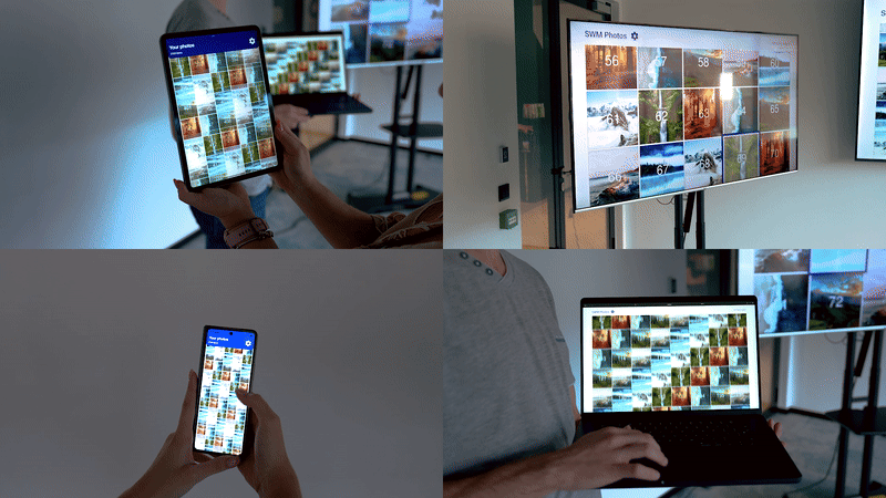
React Native lets you build apps for multiple platforms, including TVs like Fire TV, Android TV, and tvOS, as well as the web and other devices. In this article, we’ve gone over the key steps to prepare your app for these environments and ensure a consistent user experience across platforms.
If you’d like to see our photo gallery app in action, check out the code repository. Try the app on different platforms, share your observations in the comments, and let’s keep growing the React Native ecosystem together!
Huge thanks to Igor Swat and Giovanni Laquidara for all their contributions to this project!
We’re Software Mansion: multimedia experts, AI explorers, React Native core contributors, community builders, and software development consultants.