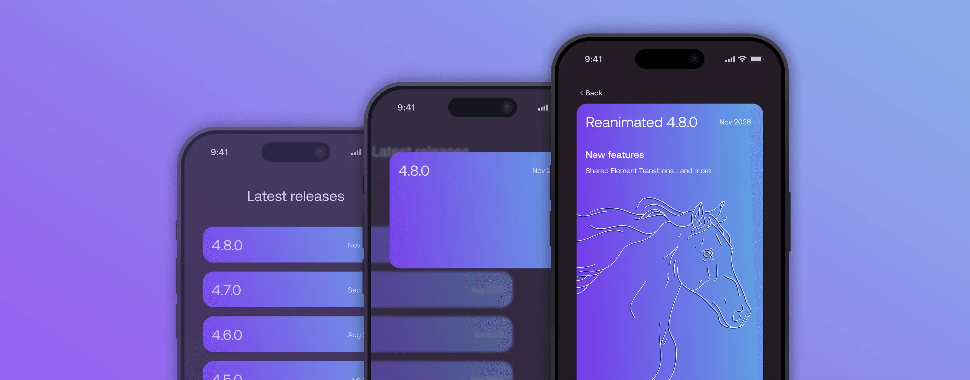

Shared Element Transitions in Reanimated 4.8.0
Reanimated Layout Animations are so good because they let you express a simple concept in a simple way, despite the implementation underneath having to deal with many complicated edge cases. You can simply say I want to run a fade animation as this component is unmounted and Reanimated takes care of the component's lifecycle. Handling this purely in React doesn't make much sense, the component is either mounted or not, and introducing separate intermediate state in your code would quickly make it a mess. You can also say I want this component to animate position change whenever it moves. This sounds simple enough to do in React until you realize that the component might change its layout without ever rerendering.
These APIs let you automatically animate insertion, removal, or layout updates for any View, which are natural discrete operations in React. There is something that is not purely expressible in React, moving a component from one parent to another. Obviously you can create two instances of the same component with similar state, but they are not connected in any sense. With Reanimated Shared Element Transitions we let you easily associate two Views, and whenever one of them becomes active, we run an animation that gives your users proper continuity. So now you can say When the user opens the audio player, the album cover should move there from the songs list.
How to use it
The idea is simple, you use sharedTransitionTag to mark components as connected, put them in different SharedTransitionBoundary components, and whenever you flip the isActive state on the boundaries, the View will just visually travel between them. You can easily combine this with useIsFocused from react-navigation or expo-router and make the animation run on screen change. You can customize the animation using sharedTransitionStyle, read more about it in our extensive documentation.
Underneath, when the transition is triggered, we:
- hide the target view using opacity
- remove the source view from its original parent
- put it under the root so it appears on top of the whole app
- animate it until it reaches the target view position
- in one atomic transaction:
- move the source view back to its original parent
- unhide the target view
New features
Shared Element Transitions have been in our experimental channel for a while and through that process we were able to observe where the API lacked some flexibility. This led us to introduce the following new features:
SharedTransitionBoundary
The transitions were implicitly triggered by stack push and pop. We decided to untie the transition lifecycle from navigation. This new component lets you run a transition between two containers that live in the same screen, and makes you explicitly opt in screens for running transitions. This approach made it much simpler for us to support Shared Transitions between tabs in a Tab Navigator, and you could even build your own custom navigation flows within a single screen that will be able to run transitions.
fadeContent
Until now, the API ignored a big problem, the Shared Element might have different children on both screens. This resulted in the children components jumping from one state to another in a rather unimpressive way. To tackle that we introduce the fadeContent modifier on the SharedTransition builder. It simply fades such children out on the source View, and fades the children in on the target View. Obviously, if the children are shared, they will run their own Shared Element Transition. You can see how much nicer it looks here:
Continuity
One of the cooler things with this implementation is that we don't take a snapshot of the view for the duration of the transition. We actually animate the real thing. This means that if both source and target share the same native state, they can continue their usual operations throughout the transition. You can see that with this snow animation, where the particles don't freeze during the animation and they also don't flip to a different position when the source and target views are flipped.
What took you so long?
Some time ago we experimented with the first version of this API on the Old React Native Architecture. It consisted of two implementations for Android and iOS with some shared logic in JS and C++. The number of edge cases to cover there made it very hard to maintain, and the platform drift was staggering. Adding new features like handling native Tabs required a lot of work and wouldn't scale to covering custom navigators. Releasing that as stable wasn't possible, as we couldn't promise proper maintenance and wouldn't be able to build much further on that foundation.
Since then, a lot has changed. We moved to the New Architecture, which let us interject between React Native and the platform in a shared C++ layer, decreasing a lot of the maintenance burden. The API choice with SharedTransitionBoundary made it straightforward to handle the Navigator edge cases, while putting only a small tax on the users, now instead of guessing what the Navigator is doing on the native side, we can just get that information from the current render via the isActive prop. Lastly, the new tooling we have makes it much simpler to investigate the types of bugs this feature might produce, which are usually related to the order of updates in React Native and the platform.
Other 4.8 goodies
Animated Text
Displaying an animated number has always been strangely hard. The value lives on the UI thread, but text is something React renders, so you either rerender the component on every frame or reach for the well known trick: a non-editable TextInput with its text prop animated through useAnimatedProps. It works, but nobody really wants to explain that hack in code review. In 4.8 you can simply pass a shared value as a child of Animated.Text:
const progress = useSharedValue(0);

<Animated.Text>Downloading: {progress}%</Animated.Text>;
The shared value is rendered as a nested text that the UI thread updates directly, without a single React rerender. You can mix it freely with static text, and if you need formatting, like rounding or adding a unit, just wrap it in useDerivedValue.
CSS animations
The CSS animations and transitions keep getting closer to what you know from the web. In 4.8 you can animate backgroundImage, so gradients now smoothly interpolate their colors, color stop positions, angle, and radial size and position. We also added support for borderCurve, writingDirection, verticalAlign and objectFit, and PlatformColor values no longer crash your animations.
Under the hood
As always, there are plenty of improvements you won't see directly but will hopefully feel. We cut a lot of unnecessary work from every frame, on both the UI and the JS thread, so your animations should get a bit lighter across the board.
Thank you
We hope you enjoy this big release, the wait is finally over!